SwapfietsNext level customer service
- Mobility
- Native app
- UX/UI Design

Menu

70k
Sleek and modernly designed, with optimal service. The fitness studio, Rocycle, puts a new spin on spinning. However, the online experience lagged behind. Label A therefore built a completely new app within 16 weeks that cleverly utilizes the existing backend.
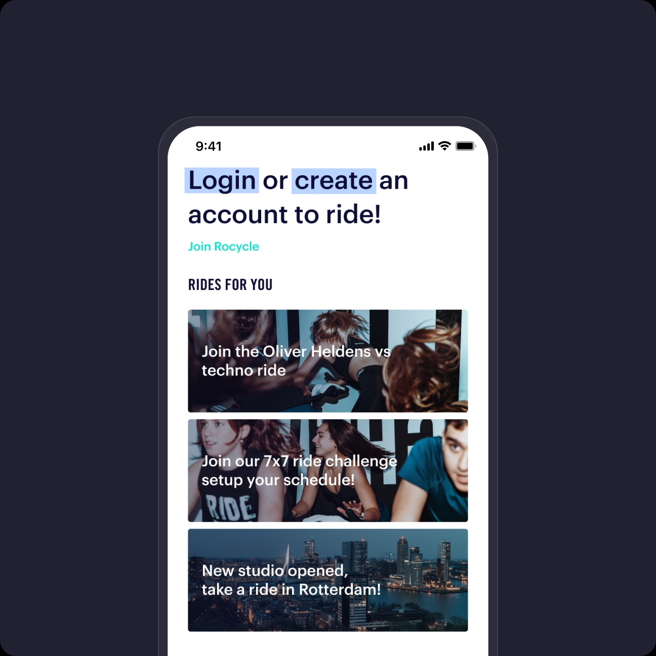
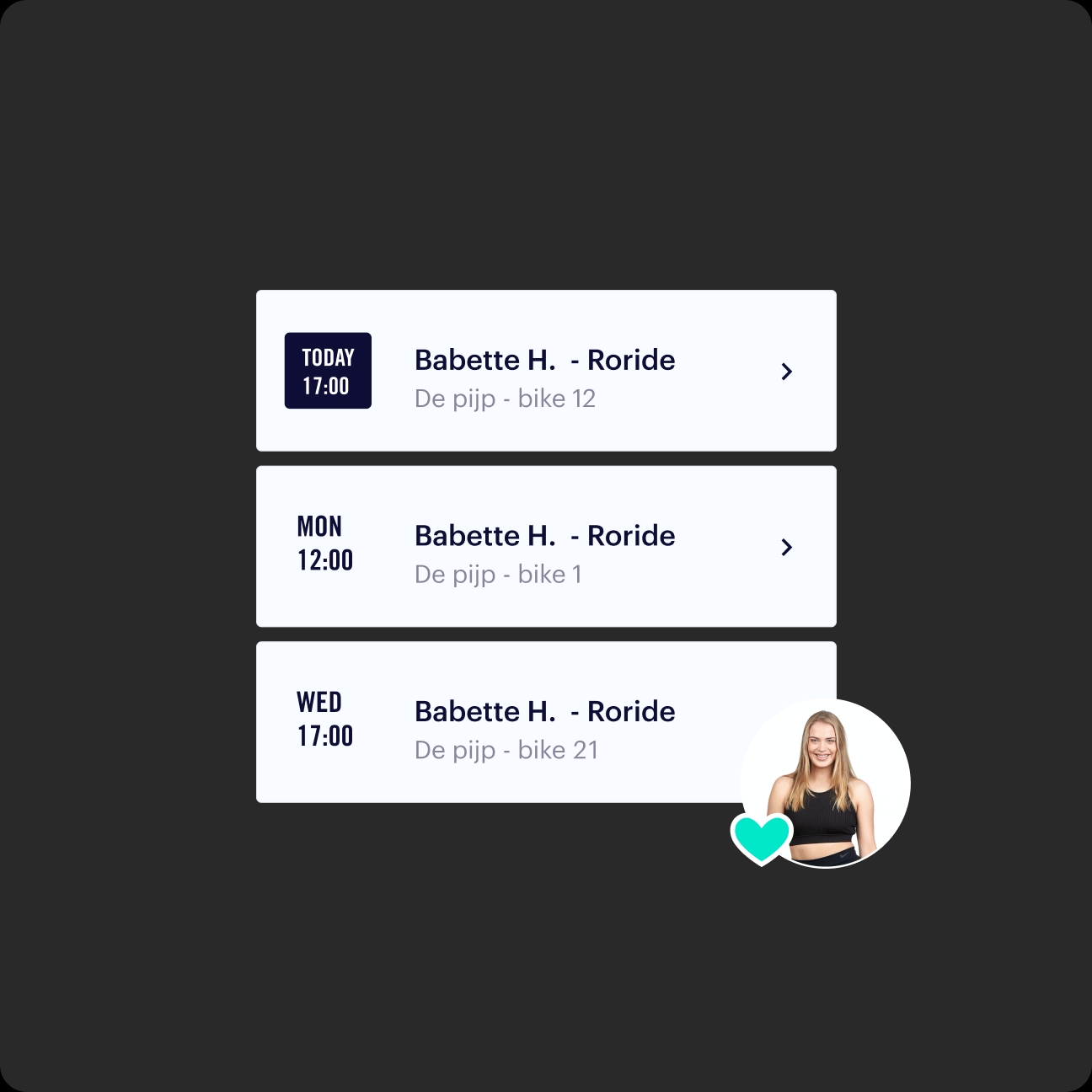
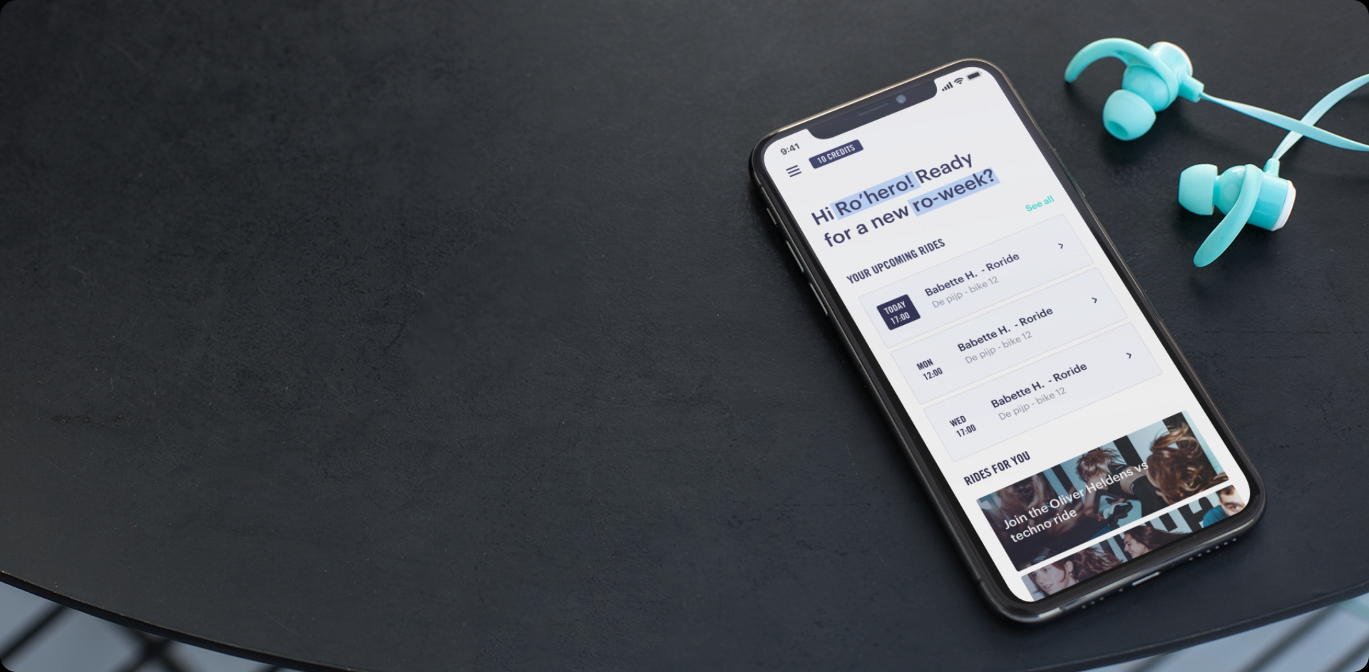
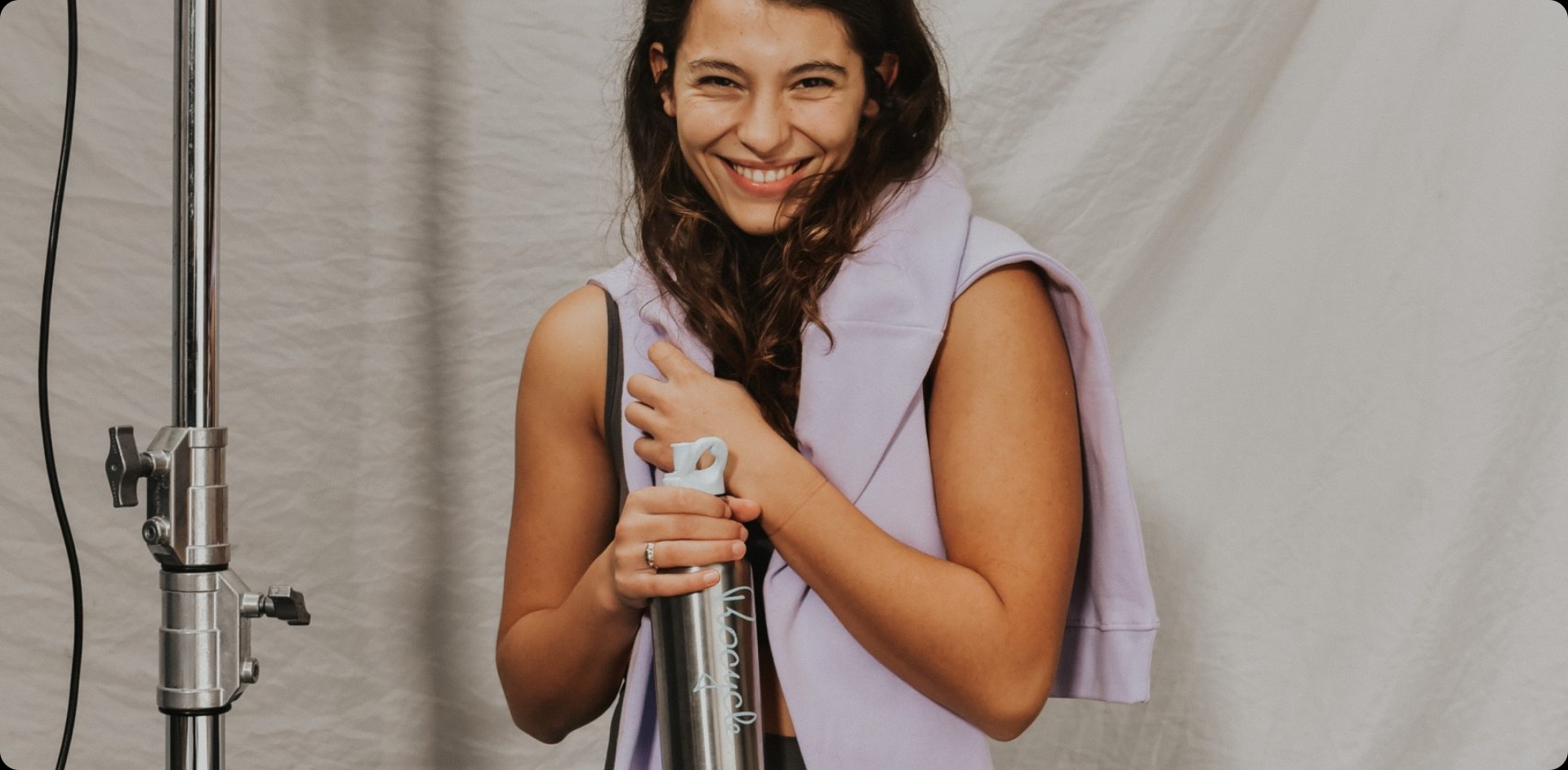
At Rocycle, customers are called Ro’riders. They receive a water bottle and spinning shoes, candlelight, modern ventilation systems and excellent guidance from a charismatic instructor. Party on a bike music blasts from top speakers. Afterward there's a luxurious changing room with Zenology shower essentials, soft towels and hairdryers. Rocycle offers a luxurious club experience for the upper market, mostly women. The app for booking and paying for classes did not keep pace with the physical experience. Rocycle asked Label A to completely rebuild the app and create the online experience that Ro’heroes expect.
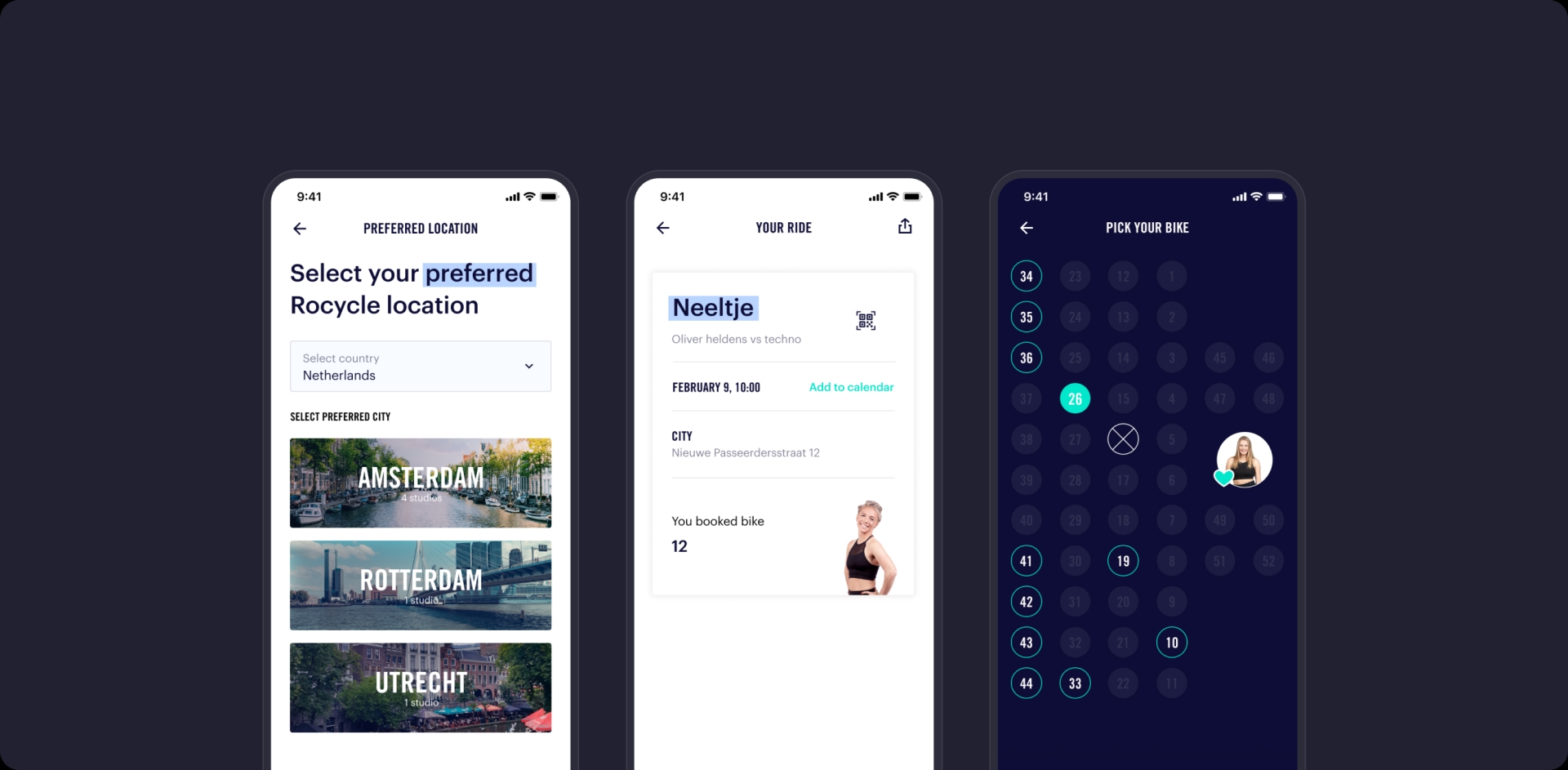
Rocycle uses Zingfit to manage classes, a widely used system for fitness centers. It was precisely at the front end in the app that the experience did not align with the Rocycle concept. Therefore, we built a new app that efficiently communicates with Zingfit and fully takes into account the wishes and needs of customers. Our designers and front-end developers involved customers throughout the construction process and our scrum master Sanne, could contribute and collaborate with the team based on her experience as an enthusiastic Ro’hero.
Built a react native app from scratch in 16 weeks with two front-end developers, a designer and a scrum master.
Customized for a better experience without having to adapt the company's underlying infrastructure and procedures.
Design that translates the minimalist style of the physical locations online with plenty of white space, light colors and calm images.
Positive customer feedback on the app: screens load faster and booking classes is much clearer.
Rocycle gave us complete confidence in this rebuild. We had regular consultations, with a focus on how we could best help their customers. The scrum agile methodology worked optimally for this project. We regularly presented new features to the target audience, quickly confirming or refuting our assumptions. This allowed us to test rapidly and identify essential stumbling blocks for customers. In 16 weeks, we launched a new app that fully centers on customer experience and aligns optimally with the Rocycle concept. Customers now receive the question when opening the app: "Ro’hero, ready for a new Ro’week?" The app and the physical fitness studios are ready for them.
We're not just solving cases; we're crafting resolutions. Our dedicated team of experts is committed to bringing you the answers you need. Trust us to navigate the complexities and find the best path forward. Your case is our priority. Let's work together to achieve the solution you deserve.

Jeffrey Bouva
Account & Tech Director
